-
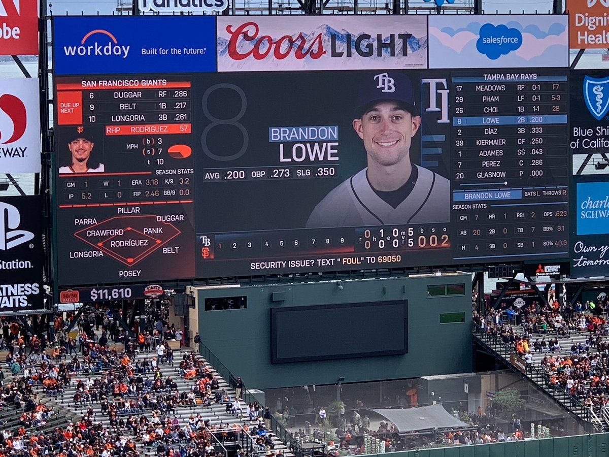
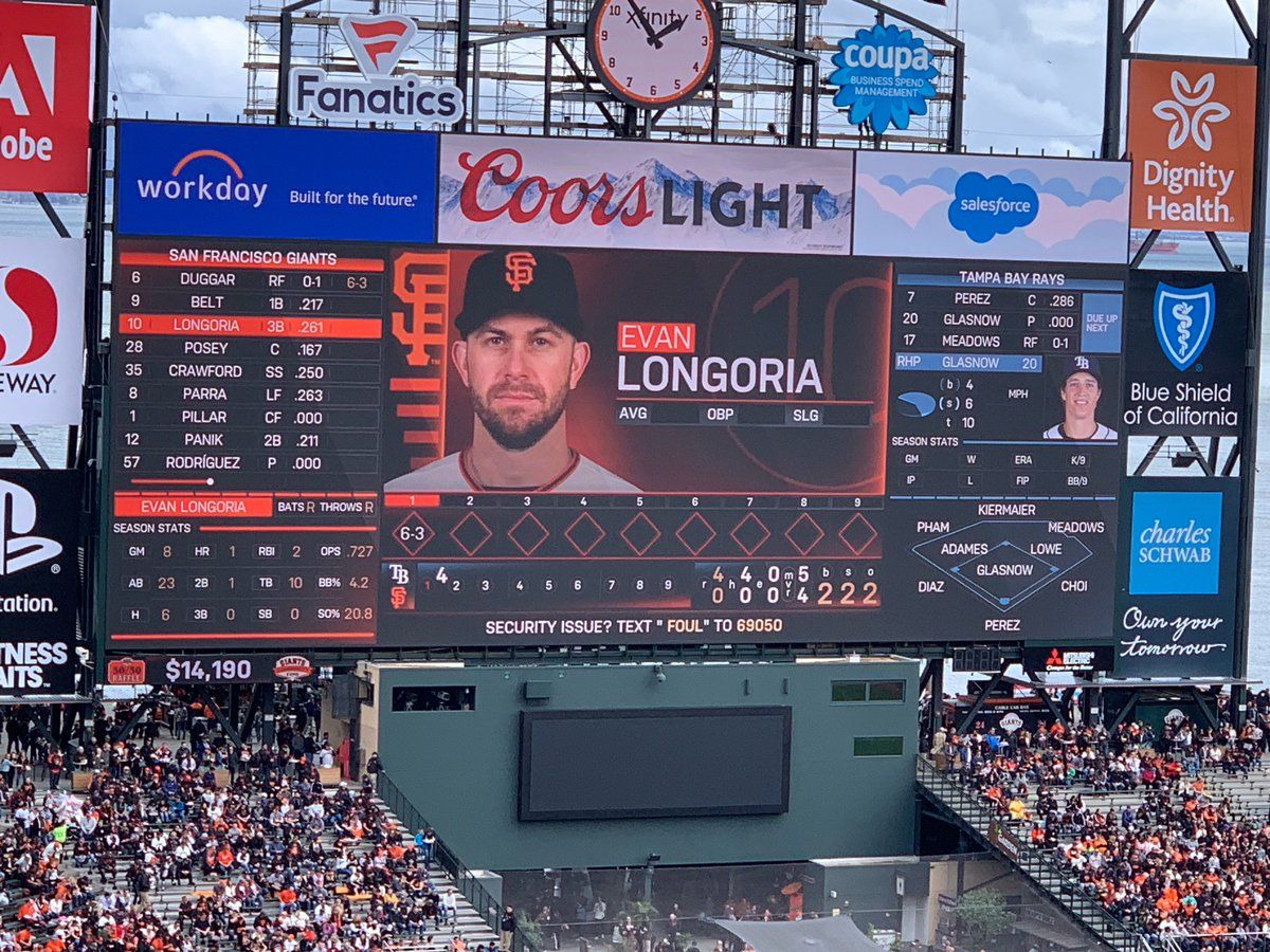
The new @SFGiants scoreboard has room for lots of stats, and they've made some interesting choices. The pie chart for balls and strikes and the defensive alignment chart seem like wastes of space. I like seeing some advanced stats, but there could be more. It's a work in progressOn twitter.com
 ♻️ 2 Retweets
❤️ 17 Favorites
Mood +8 🙂
♻️ 2 Retweets
❤️ 17 Favorites
Mood +8 🙂
-
@SFGiants The colored dotted line above the bottom corner boxes is actually a set of "tabs" that occasionally flip open and change into something else, like a chart of different pitches thrown by the current pitcher. Anyway, I hope it evolves over time as they get the hang of itPermalink On twitter.com
❤️ 6 Favorites
Mood +4 🙂
-
@SFGiants The indicator for previous at bats is still a "scorebook" style strip with diamonds for each inning. Criticism: it's just a flat background. If you're going to use the scorebook convention, you should indicate where they got to on base and if they scored by filling in the diamondPermalink On twitter.com
 ❤️ 10 Favorites
Mood -1 🙁
❤️ 10 Favorites
Mood -1 🙁
-
@SFGiants Anyway, it was opening day for the scoreboard as well and they had a bunch of technical problems. I'm sure they'll work the bugs out. I am fascinated by the decisions that must have gone into designing this thing.Permalink On twitter.com
❤️ 9 Favorites
Mood +1 🙂
-
@SFGiants I don't know if I've seen anyone write a story about the information design decisions behind something like the scoreboard. Would be a fun story.Permalink On twitter.com
♻️ 1 Retweets
❤️ 20 Favorites
Mood +6 🙂